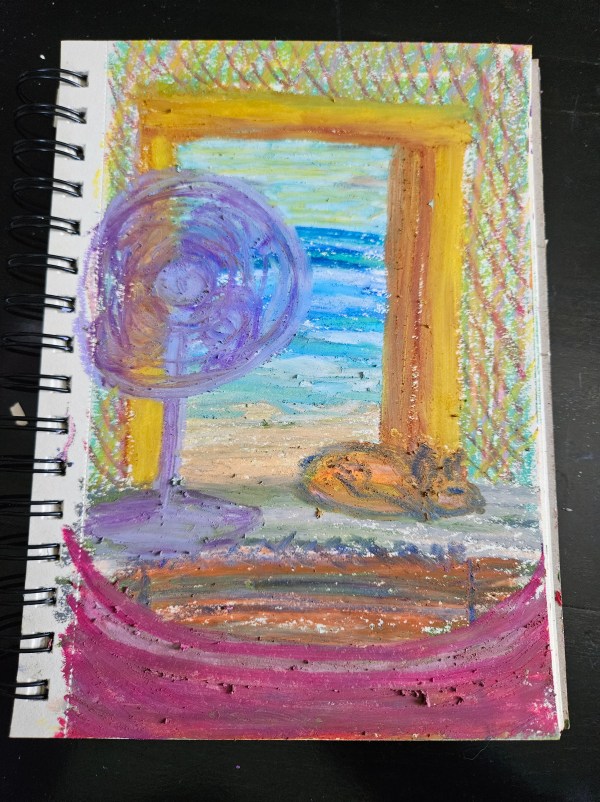
It’s not my best work, but a try to add depth to my art. I’ve been watching the Joy of Painting with Bob Ross, so I challenged myself to draw without sketching before hand.
This scene is purely from my imagination.
First, I drew the ocean scene, then the doorway and walls. I accidentally marked the page, so I added a sleeping dog to cover the mistake. Next the floor, a rug, and a fan, inspired by the fan in front of me (in real life). Finally a hammock edge, like you are lying in it, staring out to the ocean beyond.
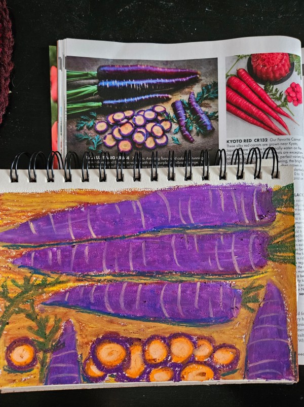
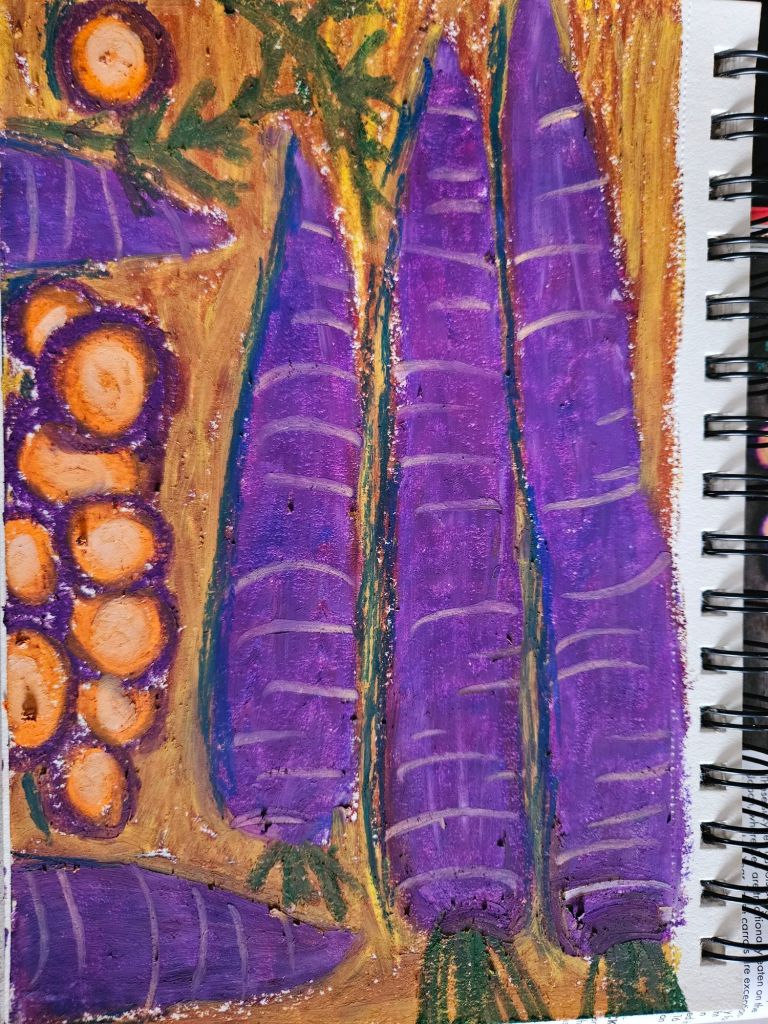
A purple carrot. At first it reminded me of Purple Heinz Ketchup from childhood. (Anyone else remember that?) But really, this purple carrot is more natural, and normal, than our uniform orange varieties. Before we domesticated carrots into monotony there were vivid, rainbows of carrot. I’m glad we never lost these to time.
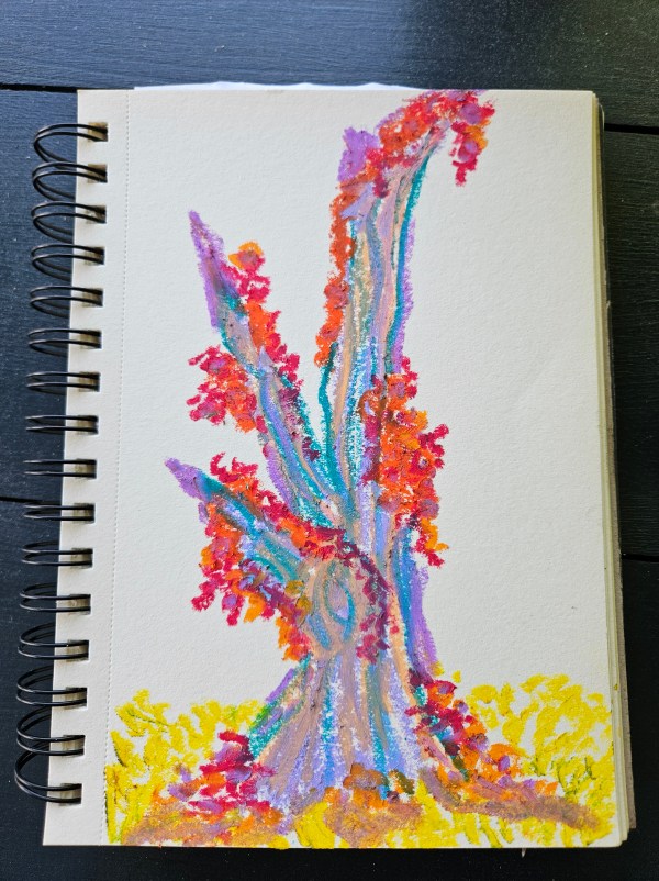
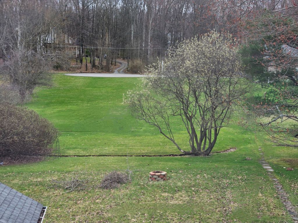
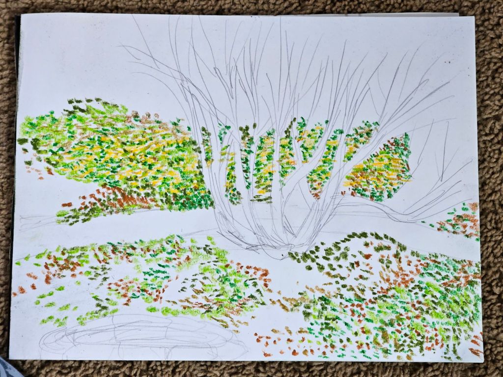
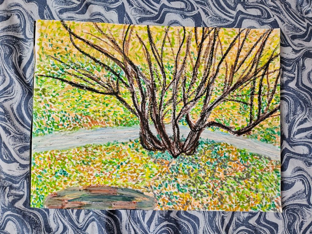
There is this dead tree in our backyard. It’s stood since we bought the house in it’s deceased way, waiting for us to chop it down. We tried, and never came back to finish the job.
It’s grown mushrooms. Helped squirrels reach the nearby tree tops. I hope a few bats have used it as a place to relax.
Here I depict an other worldly version of this tree, full of life, draped in spring blooms.
Nmixx is a relatively new K-pop band, debuting in 2022 under the label JYP Entertainment. Comprised of six members – Lily, Haewon, Bae, Sullyoon, Jiwoo, and Kyujin, they are young but immensely talented. Nmixx had a rocky start, similar to Stray Kids, who share the same label, being panned as noisy and chaotic. As time passed, Nmixx developed its sound to a polished mix-pop with killer vocals. In 2026, they are finally getting the respect they deserve, and I am thrilled to see it!
They first came on my radar in 2023, thanks to their song ‘Love Me Like This’, but I didn’t become a fan, or NSWER as their fandom is called, until 2024 with their Fe304 album series.
Fe304: BREAK released in January 2024, with songs such as Dash, Run for Roses, and Soñar to help me get through the chaos of moving. Fe304: STICK OUT, released in August 2024, was the soundtrack of our trip up to Erie. Fe304: FORWARD hit just as we broke ground on the garden in 2025, and this album, some days, carried me through running that tiller in the mud and stubborn grass shag. From High Horse to Slingshot, this album changed something in me, lifting Nmixx to my favorite girl group (sorry, Aespa). Nmixx scratches a creative chaos in my mind that fills me with joy.
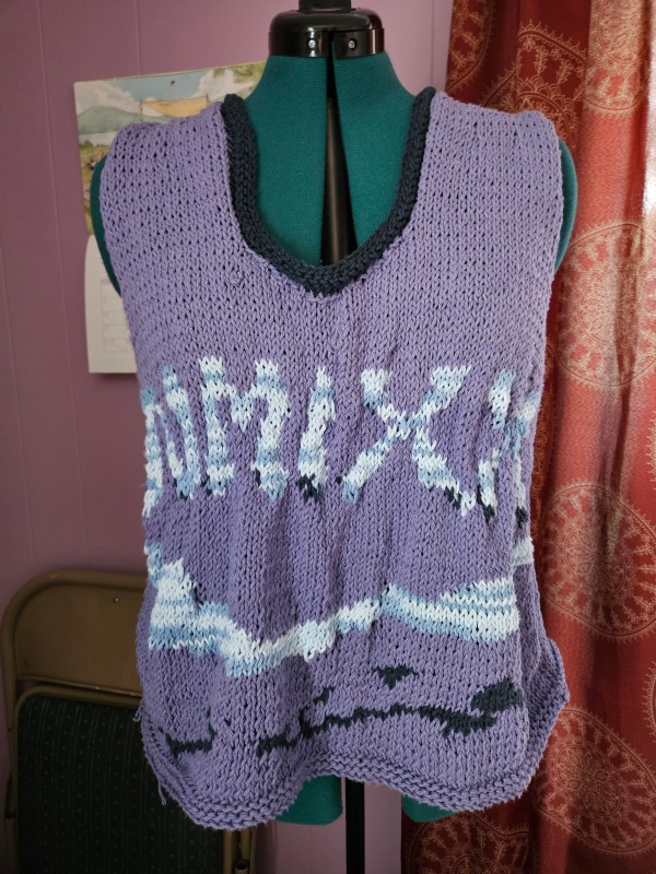
Bring a fan, I thought it would be cool to get some merch, which became quite difficult in 2025. With Nmixx being in their third year, there was a lack of offerings in the US, and those pesky tariffs from the head idiot in charge. So, I decided to get creative like I did with my Cosmic Tank.
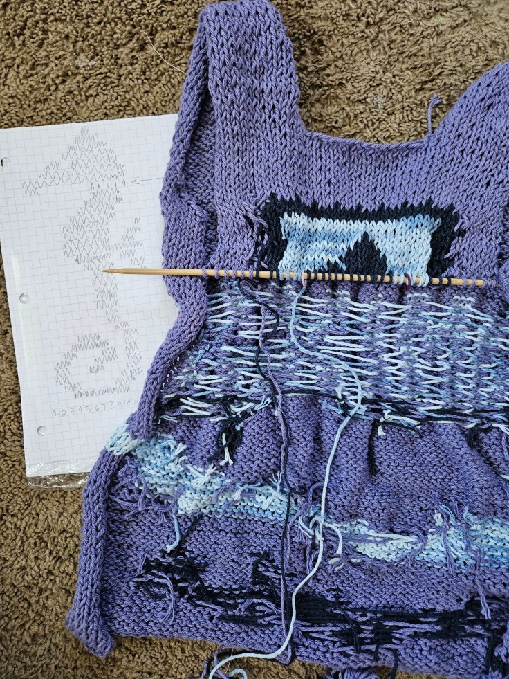
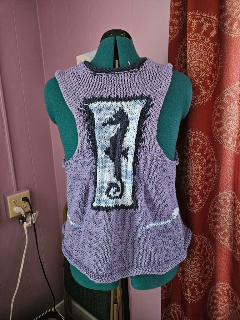
Nmixx’s lore is based on water imagery; there is a whale on their lightstick, sea creatures, boats, and a water drop font. The font was my jumping off point. I went to Michael’s and picked up water-inspired colors – a cool purple, deep blue, and a variegated blue and white to mimic light dancing on the ocean. Three songs from the album Fe304:Forward caught my attention – Ocean, High Horse, and Know About Me, which features the girls going on an under-the-sea journey on this boat spaceship. The color palette of the album is similar to the colors I chose to knit with. I knew that for the color work, I wanted to evoke waves, incorporate ocean imagery, and feature the water drop font.
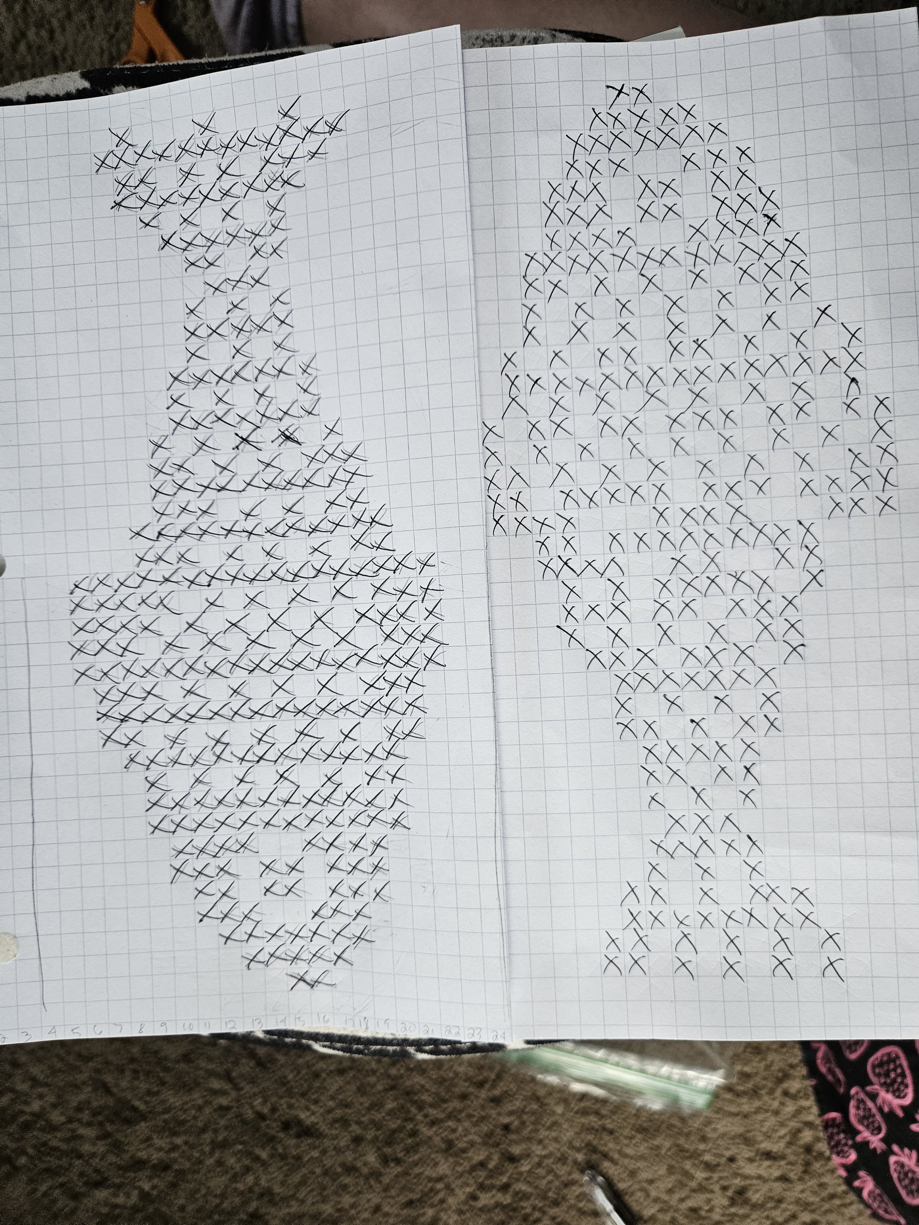
I chose to freehand a chart for the font using graph paper and an image I pulled from the internet from Nmixx promotional posts. The waves were more, see what I felt as I knit, the seahorse came from pure Pinterest roulette. The original chart was a cross-stitch seahorse that I adapted to knitting, on graph paper, later adding a stamp border to help the floats stay anchored. No pun intended. This was my first project using three colors at a time, and wow, it was brutal. On the front, I wanted the blues to create highlights and shadows, like a water drop would have. This led to some crazy tension issues and wild floats on the back.
Another issue I ran into was scale, particularly with the font. To achieve the bubbly curves, I made my scale rather large, stretching across two pieces of graph paper, and maybe this is just inexperience, or possibly I made my chart too complex, but I noticed myself ad-libbing stitches instead of following the chart due to all the mistakes I made. It turned out just fine, but it was not executed exactly how I wanted it to be. I’m pleased with the waves on the bottom and how they wrap around the tank. The back, I am lukewarm towards. I like the placement of the seahorse, for “High Horse” and the stamp for the journey they embark on, but the racer back is a little messy, since I was freehanding this pattern. But hey, the only way to get better is to practice.
Compared to my Red Velvet project, I felt confident that I could execute something to bring me joy and capture the spirit of the Fe304: Forward album. I love how this piece is one of a kind. No one else has this t-shirt or artwork, it’s a nerdy piece of knitwear for my special interest – kpop. ☺️
With this being my third merch project, I’m excited to see what speaks to me next. I’ve considered a Stray Kids Karma project and an Aespa Armageddon logo etched into a sweater. That one is going to be a big project, the logo is so intricate that when I attempted to sketch the chart last year, it was spread across four sheets pf graph paper. Maybe an Ateez project? Who knows. I do know that making your own art, and combining it with something you are passionate about, is a fantastic experience. Your passion becomes this physical object you can show off, and hopefully, bring a little sunshine to the world around you.
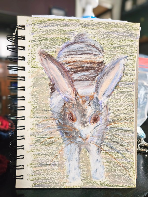
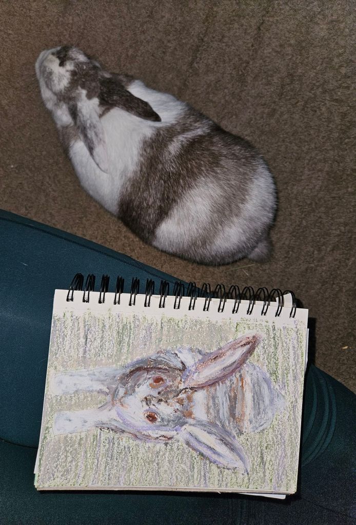
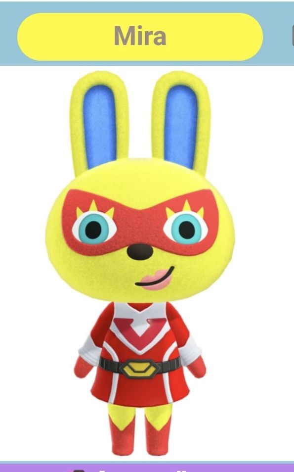
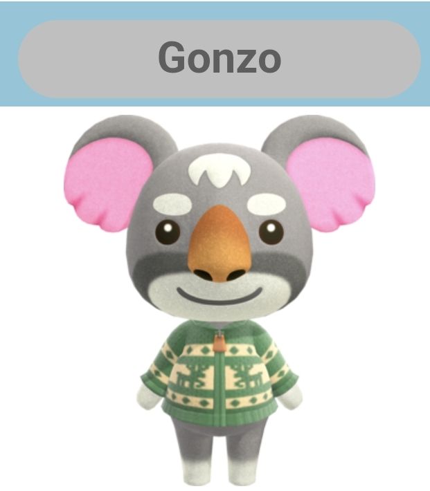
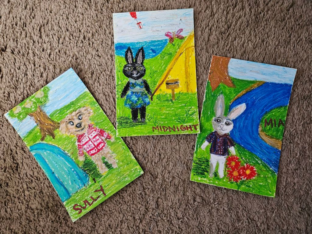
Remember last year when I said I was going to create art consistently, starting with a study of Van Gogh? Oh good, me either. 😅 But in all seriousness, I am committed to making art this year. I miss it. These are three pet portraits I did of Midnight, Sully, and Mia, a few weeks ago in oil pastel.
I was inspired by Rachel Maksy to do this and spark a bit more joy in my life – and it did more than that! It helped me process grief too. I lost Midnight, over 15 years ago and Sully, just last August. Picturing them, hanging with my villager character, on this imaginary ACNH island, is a comforting little story.
For Midnight, I was inspired by Mira, for her spunky personality and fearlessness. I decided to change Midnight’s outfit to a clover dress from game, since loved clover the most of any treats!
Although Sully was Yorkie-Bichon mix, the dog and wolf characters are draw quite differently than what he looked like. Gonzo the koala in a perfectly Sully-looking sweater was just the ticket to capture Sully’s teddy bear essence.
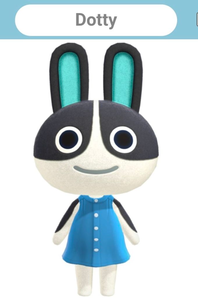
Finally Mia was easy to pinpoint, Dottie looks like a Dutch rabbit which is similar to Mia’s harlequin color pattern. Since Mia loves baseball, dressing her in a baseball jersey seemed right.
I hope this brings you a little joy today. Wherever you are I hope you know you are special and deserving of love.
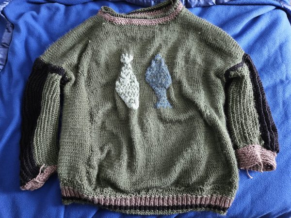
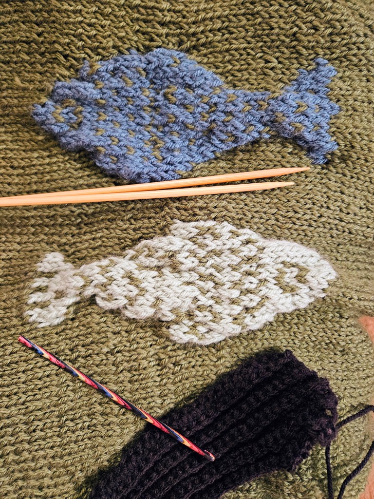
In 2025, sardines and other tinned fish became more than just food; they appeared on beaded bags, shirts, and prints. They also made their way to the fiber arts community, which inspired me to make a fish print sweater for Kyle, who enjoys fishing IRL and in video games. I just like the video game version.
The Design Concept
When planning a garment with a colorwork motif, I always consider scale, placement, and repetition. To do this, I use what I learned in art class many years ago – the seven fundamentals of art. So I consider line, shape, color, value, form, texture, and scale. In the catch-of-the-day sweater, it was important to make the fish wearable and to ensure good form and function. How do I make the fish on this sweater make sense? I decided to hang freshly caught fish on the sweater to help with the scale of the art. I placed them in the center, on the front, only to keep the perspective of this in focus. I thought placing more fish would become overwhelming to the eye and become unwearable.
Adding more fish would have required adjusting the scale and the color, meaning I would have simplified the sweater down to two yarn colors only, with sections of fair isle colorwork, which is a smaller, more concentrated technique. But I like the color contrast of using two colors, representing two types of fish with slightly different scale patterns. How big is too big? How do you represent a fish, with their scales and texture? For this, I went to Pinterest to find cross-stitch or knitting colorwork charts for inspiration. I believe I settled on a cross-stitch pattern because it had the detailed lines and scale I was looking for. I wanted the fish to look realistic, although it could be in an imagined world like Animal Crossing New Horizons or Stardew Valley. Whimsical? I think that is the best way to sum it up.
To make my pattern, I used the cross stitch reference and transferred it to graph paper by hand, tweaking some areas to make the inspiration my own. I did this in the same application for my Red Velvet Cosmic Knit Tank project. Next, I needed to determine the scale of the fish within the sweater pattern. It’s important to plan out how many stitches you need to complete the colorwork section across your rows and keep it centered. To do this, subtract the number of stitches in your colorwork pattern from the number of stitches in your row. Divide the sum by two and adjust to keep the stitches on either side equal, to keep the pattern centered. It is also important to note how tall the color work pattern is compared to the garment you are knitting, to allow enough room above and below that the graphic motif makes sense and doesn’t look misplaced on the garment. I think I literally held my pattern up to Kyle’s chest to figure it out.
Fiber Content
For this sweater, I went in a different yarn direction to try something new. I chose a wool and acrylic blend from Knit Picks called Mighty Stitch. It was underwhelming. The yarn, while soft, pills something fierce. It is also a slim worsted weight, which was exaggerated by the large needle size I used – US 10 or 6 mm. This created a breathable, airy sweater, but dang, did it throw off my pattern and design. Eventually, I had to face my fate – I was running out of yarn, and my panel was too narrow. Not exactly the outcome you want after spending a week on the front panel with the intricate fish design. I would rather start over than frog the color work, always.
I had some decisions to make. I originally purchased the Mighty Stitch on sale, but when I ran out of yarn, it was not on sale, and I wasn’t interested in doubling the price of this already too expensive project that was in the process of failing. So like Miss Frizzle recommends, I got ready to “Take chances, make mistakes, get messy!” I went to my closet of yarn and fabric and began to dig through the stash for something else I could introduce into the design. I found a warm-toned gray and neutral black yarn from Big Twist that was also worsted weight. Because the Mighty Stitch is a washable yarn, I felt comfortable combining the two yarns. I had already introduced acrylic yarn to the project through the mint and teal fish, using scrap Big Twist for those sections. Always check your fiber content, though, to avoid incompatible fibers that will make the project hard to care for over time.
Making a Change
The original design was changing from color palette to overall concept. This sweater would need to have color blocking sections now, to stretch the main green color. I decided to not only change up the design, but to change up my technique, opting for crochet on the sleeves to make the sleeves go faster. Knitting is a slow craft, and for some reason, knitted garments for Kyle have this curse of going horribly wrong and also knitting up slowly because of the hiccups. I wanted him to be able to wear this sweater for the bulk of the winter season of 2025-2026, and I was knitting this in August-October, so I took a shortcut. But in my defense, the texture of the sleeves, ironically, looks like fish scales to me. Especially with the gray and black colors!
The second change I made was adding width to the sides of the front panel to make the sweater a drop shoulder. I then knit the back panel wider from the start, and added a section of gray on the middle to upper back panel. It adds a nice contrast to the overall composition of the sweater, while making the sleeves feel cohesive.
Men vs Women Shoulder Shaping
The shoulders gave me such grief in this project! I’m used to making sweaters for myself and my female form. The bust makes the shoulders rest differently than I realized, and this came back to bite me. For a man’s sweater, the back needs to be longer. Especially the shoulder section on the back of the sweater is going to ride up the back, and be too long in the front. This happened, and I was bamboozled on how to fix it. Enter short row shaping and the principles of perspective and scale.
I learned that I needed to add short rows, meaning only working a section across a row to add length to a specific portion of the back panel, the back middle. To do this, you work back and forth on the section, evenually go back to working across the entire row. In addition, I made the back collar and back ribbing longer to compensate. These simple changes made the sweater appear the same length back and front, draping across the shoulders pleasantly, even if one side was technically longer. It doesn’t matter because of the role of perspective. Magic!
Final Thoughts
I learned a tremendous amount of knowledge from the Catch of the Day sweater, and I am grateful it all came together in the end to make a sweater that Kyle enjoys wearing. I have saved my patterns to attempt this again in the future with better yarn and proper dimensions to make the pattern fit well from the start, instead of scrambling to adjust at the end.
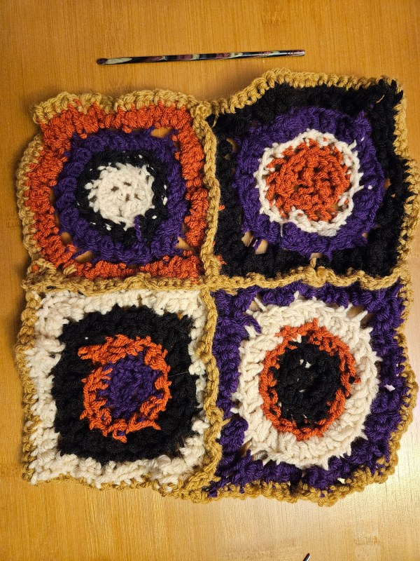
This is a new term for me, but it is genius. Craftivism is activism through crafting. It is using your art and everyday things to show what you believe and to speak out against injustice. And to use an internet term, this has completely “changed my brain chemistry” to think of using my knitting to say what I believe, just like art.
What made this a tangible thing for me to get started in community was the Welcome Blanket collection at my local yarn shop. Together, sections of knit and crochet squares would be collected and seamed into blankets, like receiving blankets, to welcome immigrants to the United States. With all the ICE-y conditions out there, it’s swimming against the current in a way that aligns with my beliefs and what we are called to do as Christians – love your neighbor and take care of immigrants. Not to worship power, money, and excuse racism like some so-called “Christians” in my country are doing. Seeing my crochet square stitched together with other like minded indivduals’ fiber art was powerful. It reminded me of how we are stronger together and how doing small things, as a community, makes a difference. I also enjoyed reflecting on my own immigrant heritage and sharing my story of how my family came to the US and why immigration is necessary.
As an American who is not Indigenous, every part of my family tree came from somewhere else. Some of my family came from Germany, I believe, in the early 1900s, since my great-grandmother, who was born in 1912 in the US, spoke German as her first language at home. Some of my family from Ireland left County Cork’s farmland during the potato famine to escape certain death from the genocide of starvation by Great Britain. Some of my family from County Armagh immigrated in the late 1800s to the US, went back to Ireland in the early 1900s, and came back again to the US during the Troubles. The rest of my family came from Canada in the 1960s. If we are not members of Indigenous nations, then we are all here because of immigration. To act like immigration is dangerous, un-American, and unwelcome is not American to me. We all came from somewhere else. Let’s love our neighbors and support them in this new chapter of their lives, which came about because of a very difficult decision.
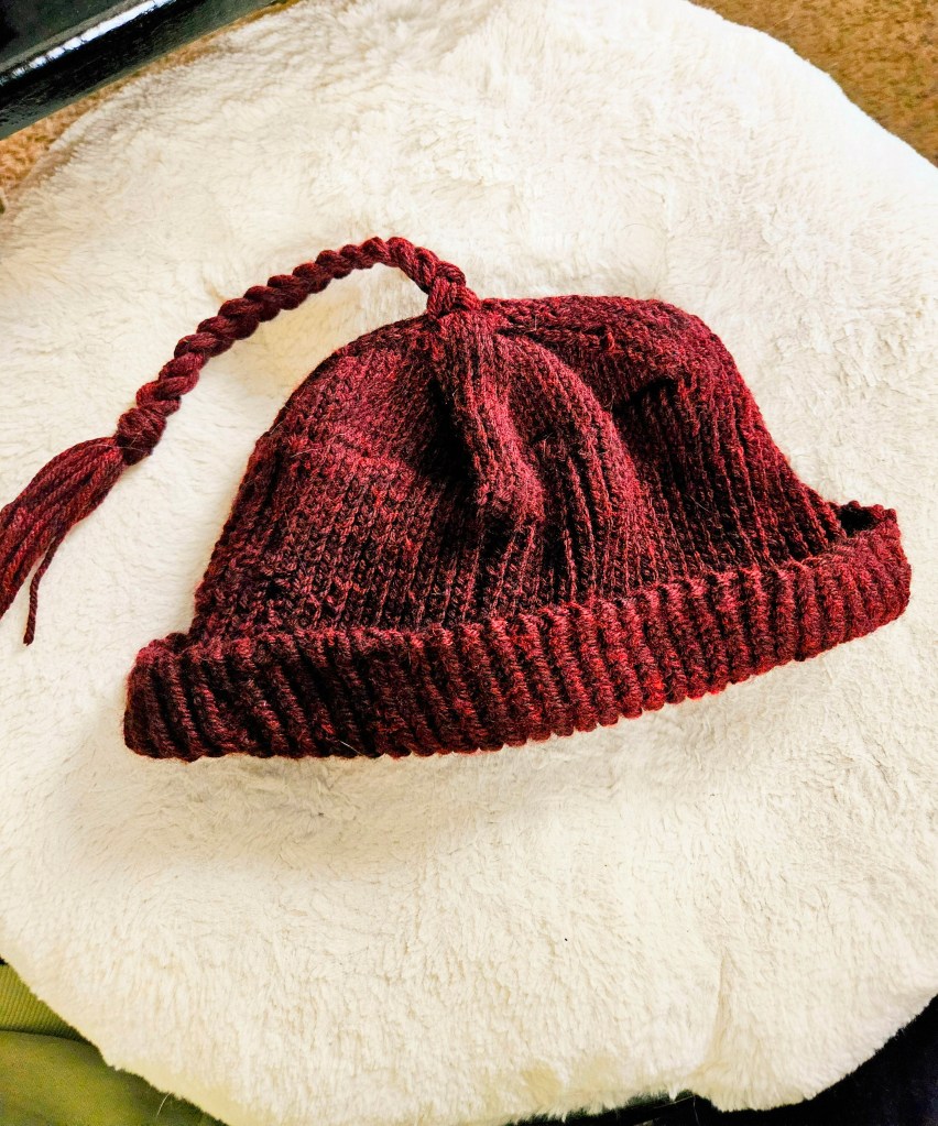
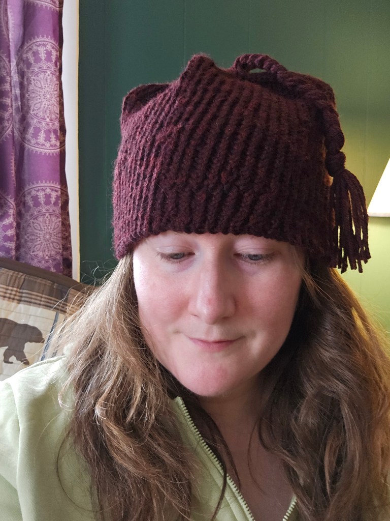
The second opportunity that brought Craftivism back on my radar was the Melt the Ice hat. This hat was used from protest by Norwegians in the 1940s during the Nazi occupation of Norway. Minnesotans, many of whom are descended from Norwegian immigrants, but now are a rich community of immigrants from all over the world, brought the hat pattern back to raise money for the Immigrant Rapid Response fund, which provides assistance for immediate needs – food, rent, etc. This fundraiser raised $650,000 with a $5 pattern during the Melt the Ice MAL in February 2026. If you are not aware of what has been going on in Minneapolis, there has been violence, there has been death, there has been kidnapping, and unlawful occupation of a city by federal forces in the name of corruption and power. Making the hat felt like there was a healthy place to channel my grief and anger over what is happening while bringing community together – Craftivism is powerful.
Have you ever heard of Craftivism? Would you participate in it?
The other day, I ran across Van Gogh’s work again and I went down a rabbit hole of researching his work and soaking it in. I saw his and other artists I admire at the Musee d’Orsay in 2010, and although no pictures were allowed those memories have carried with me. So it got me thinking, would modern life be more beautiful to us again if we saw the world through the eyes of these artists of this movement?
That’s what I plan to explore this year. This drawing above, captures the view from my sewing room. With modern infrastructure and other touches erased by the magic eraser tool to keep the analog and the natural.
The other day, I was at the back of our property with Kyle with our tiller. Above us was this pine tree we believed to be mostly dead, yet behold these little pinecones were growing, cracking open actually. The sound was this bizarre melody of crackling, like rice krispies in milk.