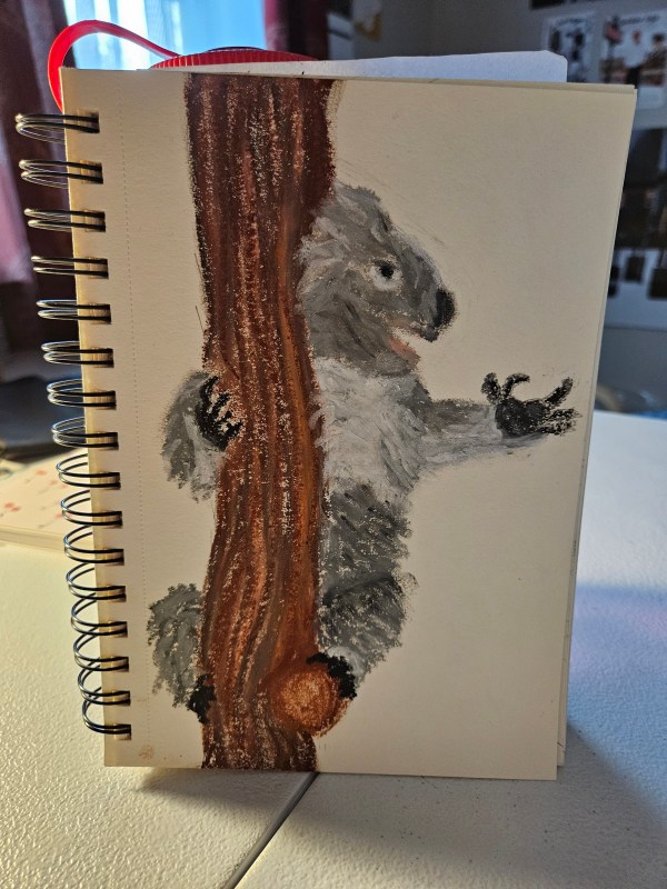
I finished my koala portrait from Koala Drawings in Pencil in a new medium, well a new old medium, a medium I haven’t used in 10 years, oil pastel! I forgot how good oil pastels are for color payoff and texture without being messy like chalk pastels or watercolors. I felt in control of the pigment while being able to direct shadows and highlights over the piece. I’m hooked!
This koala was inspired by a photo I found on Instagram from a creator with the handle @hidenoritsuzuki. Why was this image so special to me? The hand posture and facial expression reminded me so much of my stepdad and his favorite goofy way to feign exasperation. It was the hand! Totally brightened my day. 🙂
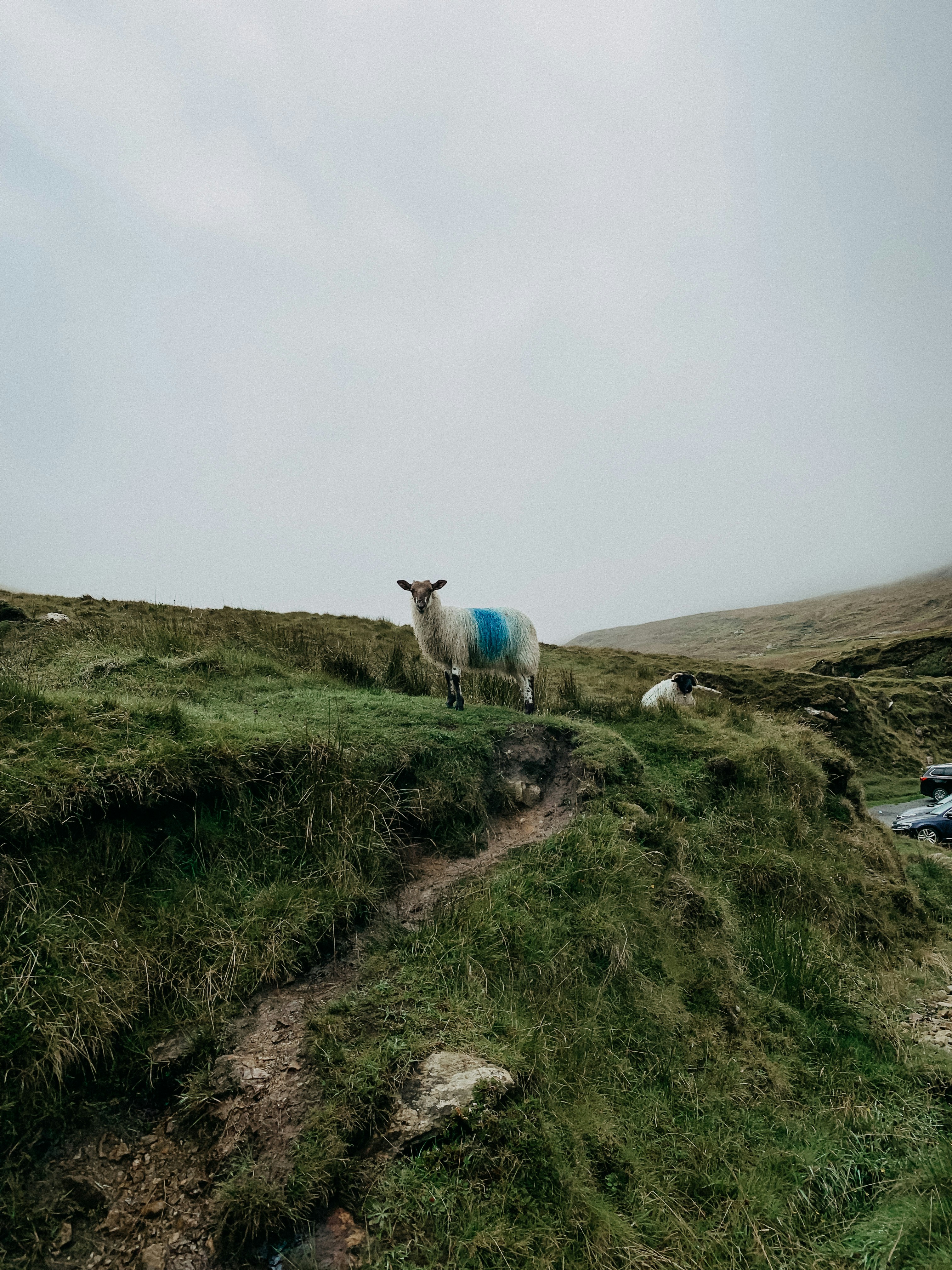
My go-to inspiration in high school was this daily calendar my mom had in her office. Each day featured a photograph from a scene in Ireland, and each day, at the end of the day, my mom would bring the paper home and give me the photograph to draw from. Before the days of Pinterest and Instagram, it was a bit tricky to find beautiful images to practice with. There were magazines of course and books, not to mention literally the world around you, but this was a game changer to get daily inspiration. In the 2000s, it was before the supremacy of the touchscreen smartphone with apps galore and fantastic cameras to snap photos in that you could carry around in your pocket. If you took photos for inspiration, you had to print them and it was not cheap. Printing even on printer paper was not cheap and trust me, parents did not like us wasting ink.
This is a taste of what the images featured via a modern source – Unsplash.
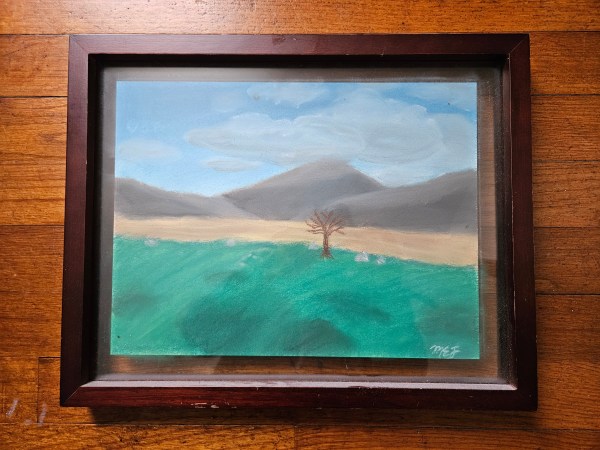
What is special to me about the framed image above is that I didn’t frame it. My grandparents did. It was a piece that I guess spoke to them and they framed it and hung it in their bedroom. Something I didn’t appreciate at the time, as a moody teenager I was embarrassed by it. Now in 2024, it hangs in the hallway outside my bedroom and when I see it hanging there proudly in its frame I remember how much they believed in my art, my writing, my fashion sense. I wish I could show them all that I am doing now. I think they would be proud.
When you walk away from a discipline some of the knowledge stays with you, in the forefront of your mind. You can pick up where you left off, no matter how long it has been, like riding a bike. It is a core skill, a talent, an extension of yourself that stays with you regardless of what your hopes and dreams are in your current life.
For me personally, art in the mediums of watercolor, chalk pastel, acrylic, and block printing are forever imprinted in my brain. What has not stayed in the forefront though is how to make things look refined.
I used to possess this skill, but like a muscle group this skill needs to be practiced in order to stay toned or honed I guess is a better way to say that. To be sharp, one must sharpen through effort and practice.
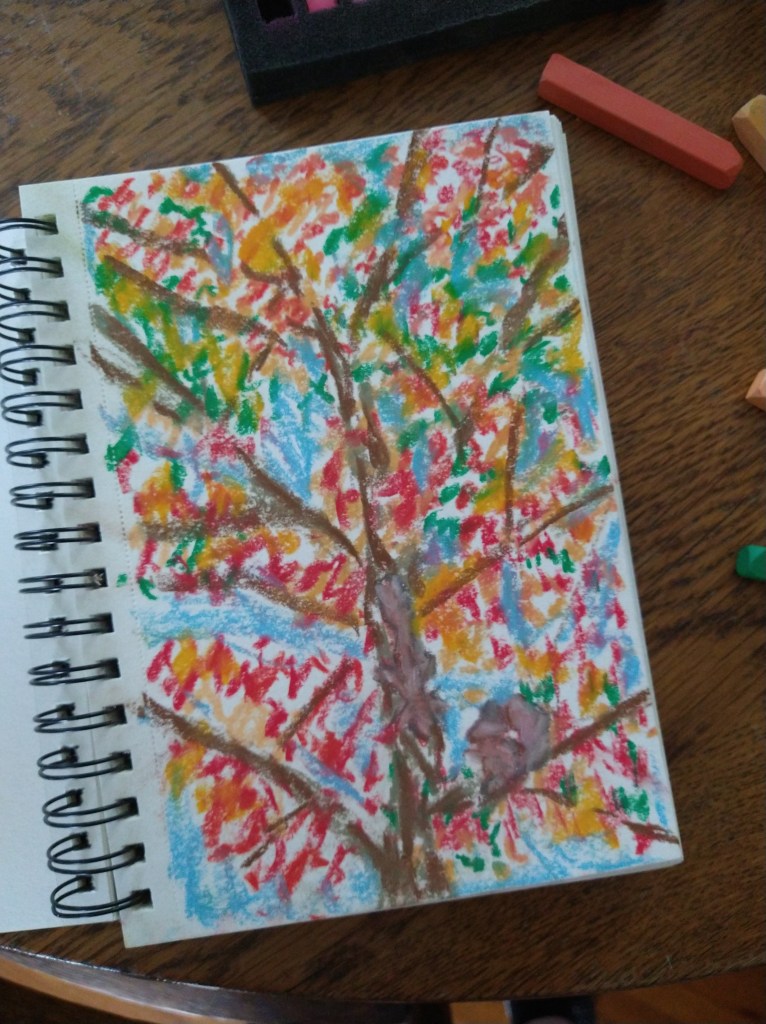
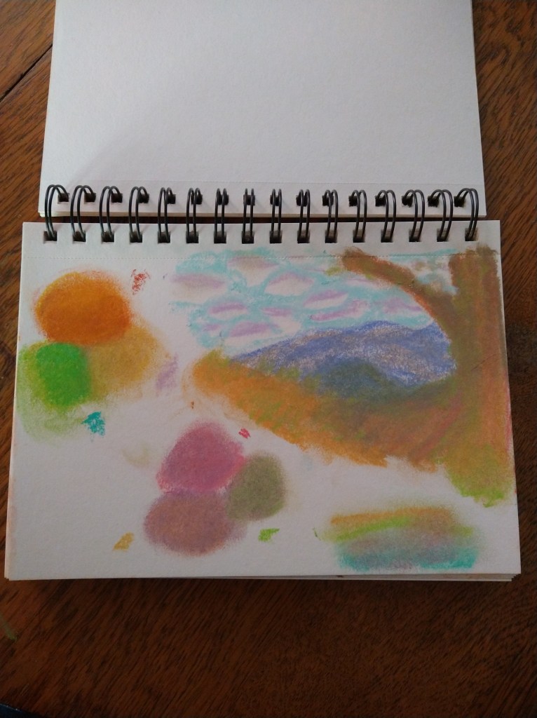
As I continue to get my sketchbook out, I’ve noticed a plateau and a desire to make the image on the page pop. Something to make it feel real, or call to me from within the composed piece. I’ve experimented with movement and pointillism. I’ve been blending, shading, and highlighting.
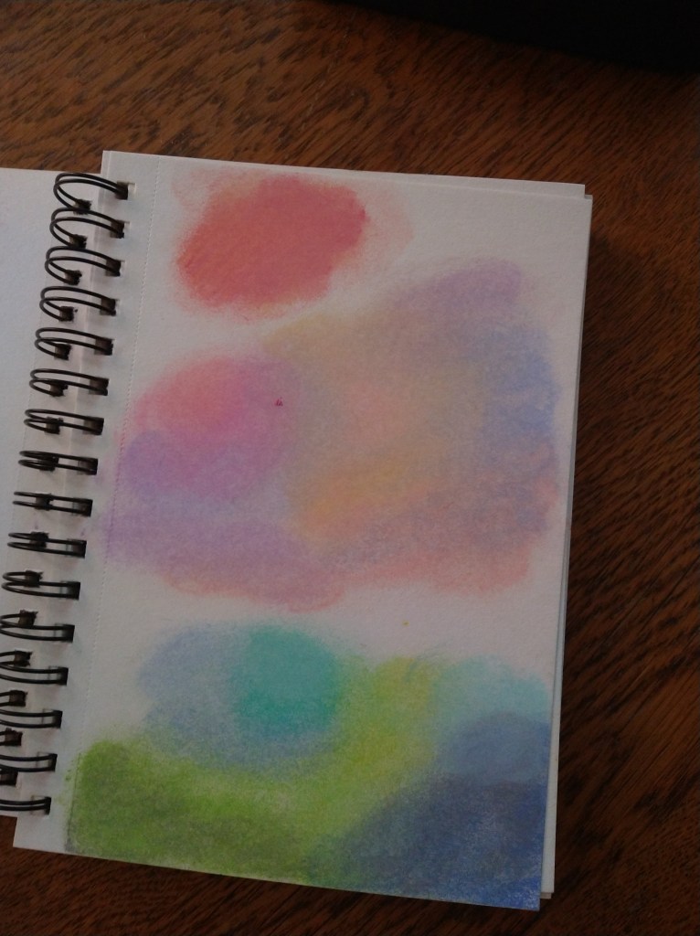
I like the highlighting, but have noticed that I am going through my white pastel at a higher speed than the rest which got me thinking. Did I always, when I was taking art classes, defer to white to make those highlights? Is there another way I have lost since I stopped practicing, that I am missing?
What about color theory? I used to mix acrylic paints in this way to achieve specific hues and richer colors that subtly told the story in my brush strokes. It added three-dimensionality to a 2D image. But, I thought to myself, how did I do that with pastels?
And so from there I have been getting in my sketchbook and shading swatches of color. I do these swatches in groups. Next, I shade a contrasting color on top and see what happens. What I am seeing is making me quite pleased. I see depth. Earthiness. I see more natural hues with darker and lighter colors blending in the swatch.
With this re-claimed knowledge, I am inspired to continue down this path of discovery to re-acquaint myself with these lost skills. I didn’t realize how much I missed art as a form of expression and coping. It brings me joy. I feel at home, but a home I haven’t visited in many years if that makes sense.
It’s interesting what sticks with us from childhood, and what becomes part of our identity. Being willing to accept who I am who is not a boss babe but a sensitive creative with a lot of ideas floating around in this noggin. I should give that part of me more time to explore, reflect, and create.
Do you have any hobbies that you have done since you were a child? If so, what motivates you to keep pursuing them?