Catch of the Day Sweater

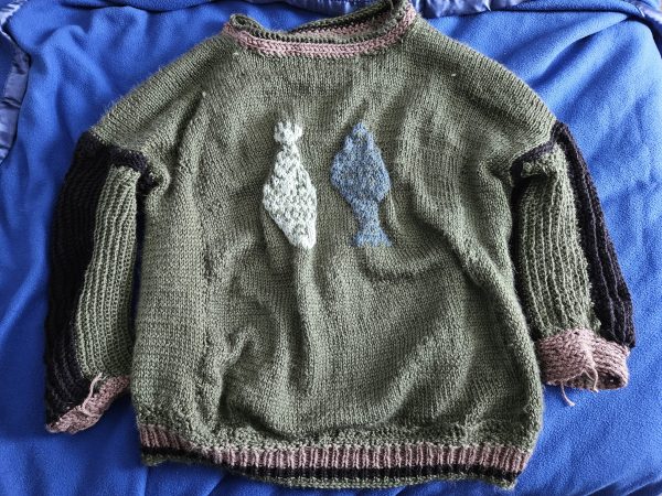
In 2025, sardines and other tinned fish became more than just food; they appeared on beaded bags, shirts, and prints. They also made their way to the fiber arts community, which inspired me to make a fish print sweater for Kyle, who enjoys fishing IRL and in video games. I just like the video game version.

The Design Concept

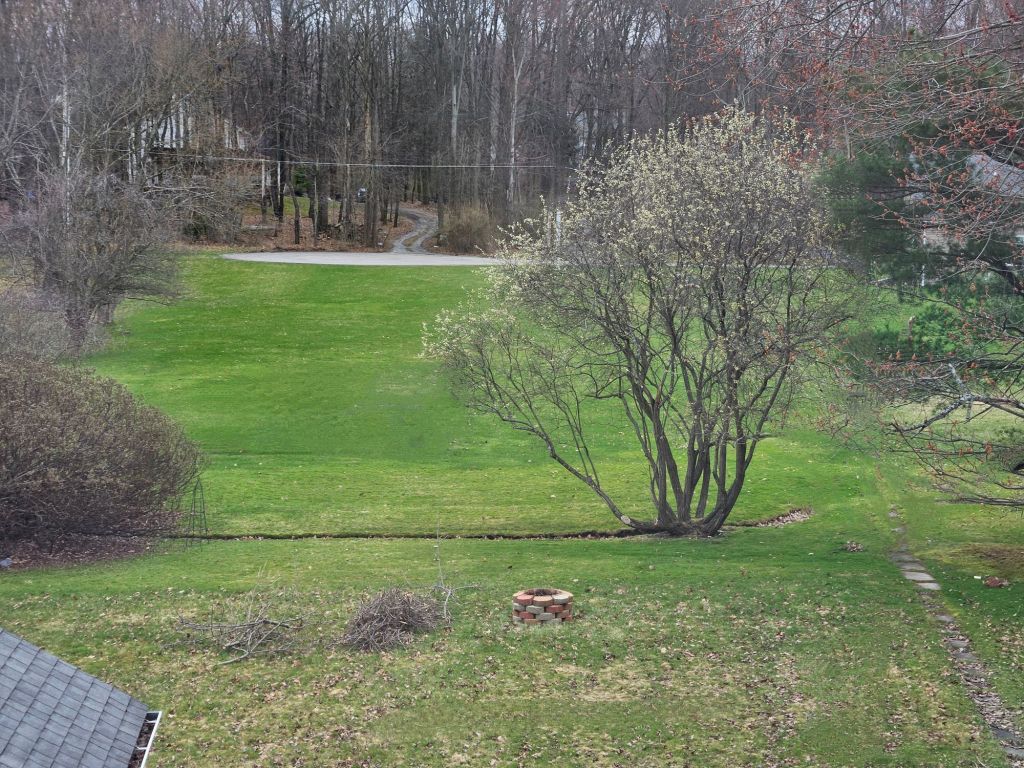
When planning a garment with a colorwork motif, I always consider scale, placement, and repetition. To do this, I use what I learned in art class many years ago – the seven fundamentals of art. So I consider line, shape, color, value, form, texture, and scale. In the catch-of-the-day sweater, it was important to make the fish wearable and to ensure good form and function. How do I make the fish on this sweater make sense? I decided to hang freshly caught fish on the sweater to help with the scale of the art. I placed them in the center, on the front, only to keep the perspective of this in focus. I thought placing more fish would become overwhelming to the eye and become unwearable.

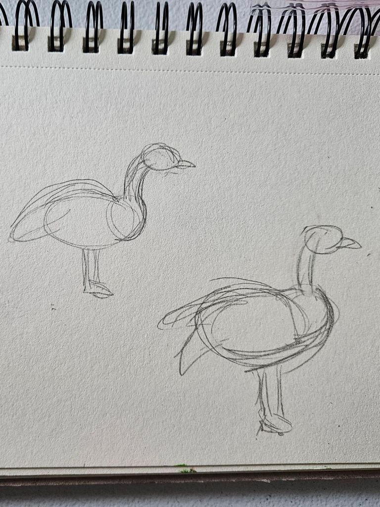
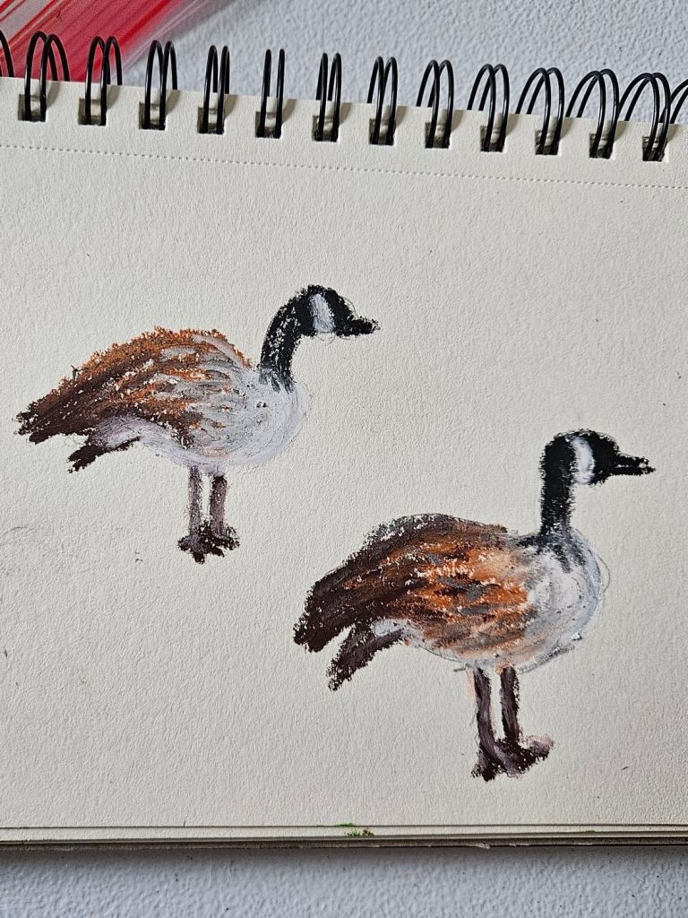
Adding more fish would have required adjusting the scale and the color, meaning I would have simplified the sweater down to two yarn colors only, with sections of fair isle colorwork, which is a smaller, more concentrated technique. But I like the color contrast of using two colors, representing two types of fish with slightly different scale patterns. How big is too big? How do you represent a fish, with their scales and texture? For this, I went to Pinterest to find cross-stitch or knitting colorwork charts for inspiration. I believe I settled on a cross-stitch pattern because it had the detailed lines and scale I was looking for. I wanted the fish to look realistic, although it could be in an imagined world like Animal Crossing New Horizons or Stardew Valley. Whimsical? I think that is the best way to sum it up.

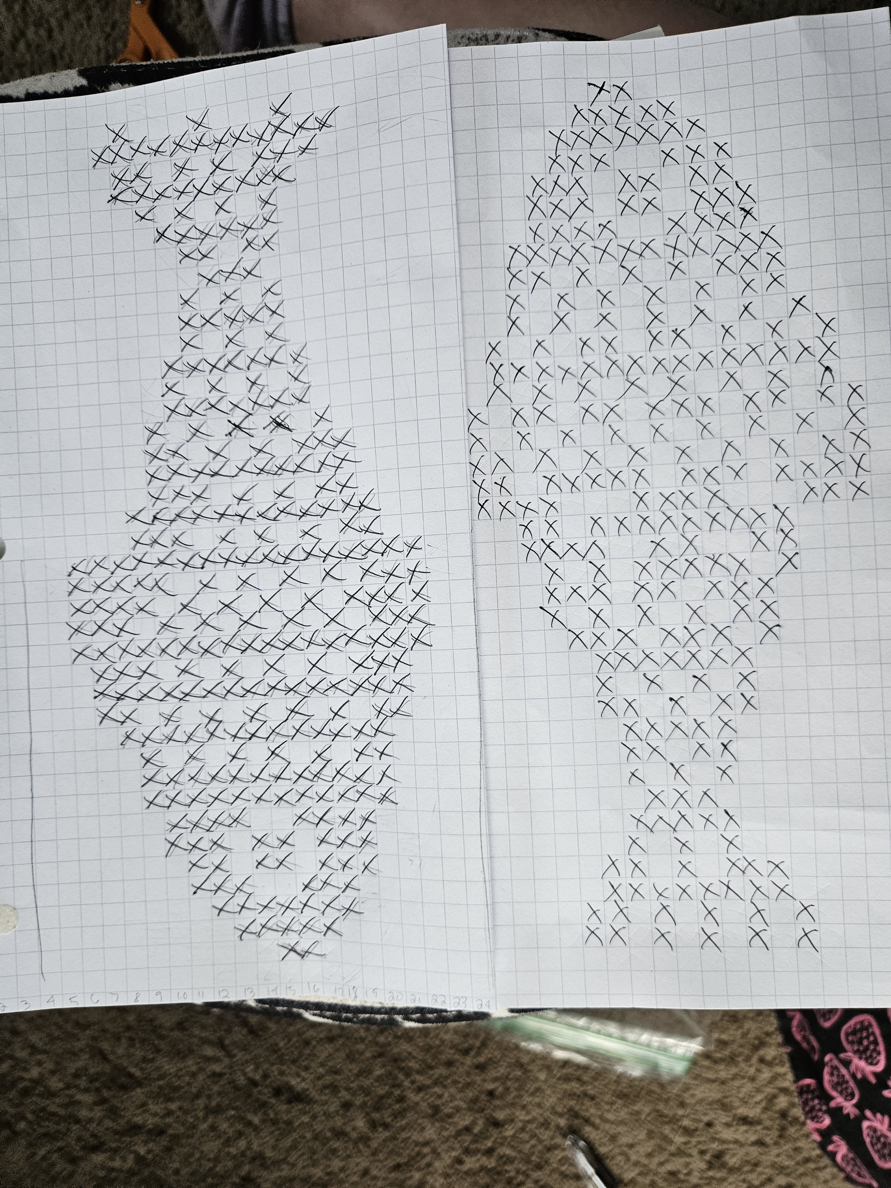
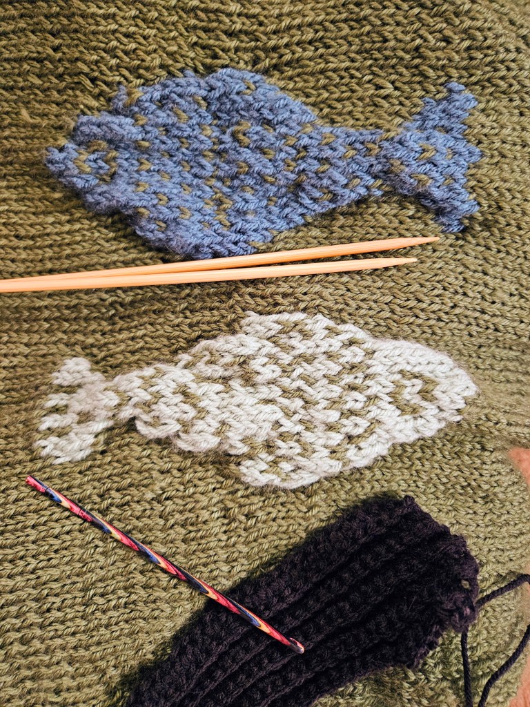
To make my pattern, I used the cross stitch reference and transferred it to graph paper by hand, tweaking some areas to make the inspiration my own. I did this in the same application for my Red Velvet Cosmic Knit Tank project. Next, I needed to determine the scale of the fish within the sweater pattern. It’s important to plan out how many stitches you need to complete the colorwork section across your rows and keep it centered. To do this, subtract the number of stitches in your colorwork pattern from the number of stitches in your row. Divide the sum by two and adjust to keep the stitches on either side equal, to keep the pattern centered. It is also important to note how tall the color work pattern is compared to the garment you are knitting, to allow enough room above and below that the graphic motif makes sense and doesn’t look misplaced on the garment. I think I literally held my pattern up to Kyle’s chest to figure it out.

Fiber Content

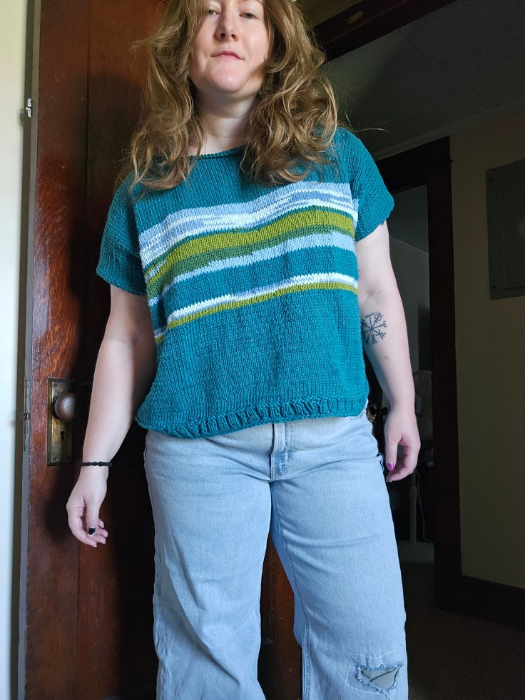
For this sweater, I went in a different yarn direction to try something new. I chose a wool and acrylic blend from Knit Picks called Mighty Stitch. It was underwhelming. The yarn, while soft, pills something fierce. It is also a slim worsted weight, which was exaggerated by the large needle size I used – US 10 or 6 mm. This created a breathable, airy sweater, but dang, did it throw off my pattern and design. Eventually, I had to face my fate – I was running out of yarn, and my panel was too narrow. Not exactly the outcome you want after spending a week on the front panel with the intricate fish design. I would rather start over than frog the color work, always.

I had some decisions to make. I originally purchased the Mighty Stitch on sale, but when I ran out of yarn, it was not on sale, and I wasn’t interested in doubling the price of this already too expensive project that was in the process of failing. So like Miss Frizzle recommends, I got ready to “Take chances, make mistakes, get messy!” I went to my closet of yarn and fabric and began to dig through the stash for something else I could introduce into the design. I found a warm-toned gray and neutral black yarn from Big Twist that was also worsted weight. Because the Mighty Stitch is a washable yarn, I felt comfortable combining the two yarns. I had already introduced acrylic yarn to the project through the mint and teal fish, using scrap Big Twist for those sections. Always check your fiber content, though, to avoid incompatible fibers that will make the project hard to care for over time.

Making a Change

The original design was changing from color palette to overall concept. This sweater would need to have color blocking sections now, to stretch the main green color. I decided to not only change up the design, but to change up my technique, opting for crochet on the sleeves to make the sleeves go faster. Knitting is a slow craft, and for some reason, knitted garments for Kyle have this curse of going horribly wrong and also knitting up slowly because of the hiccups. I wanted him to be able to wear this sweater for the bulk of the winter season of 2025-2026, and I was knitting this in August-October, so I took a shortcut. But in my defense, the texture of the sleeves, ironically, looks like fish scales to me. Especially with the gray and black colors!

The second change I made was adding width to the sides of the front panel to make the sweater a drop shoulder. I then knit the back panel wider from the start, and added a section of gray on the middle to upper back panel. It adds a nice contrast to the overall composition of the sweater, while making the sleeves feel cohesive.

Men vs Women Shoulder Shaping

The shoulders gave me such grief in this project! I’m used to making sweaters for myself and my female form. The bust makes the shoulders rest differently than I realized, and this came back to bite me. For a man’s sweater, the back needs to be longer. Especially the shoulder section on the back of the sweater is going to ride up the back, and be too long in the front. This happened, and I was bamboozled on how to fix it. Enter short row shaping and the principles of perspective and scale.

I learned that I needed to add short rows, meaning only working a section across a row to add length to a specific portion of the back panel, the back middle. To do this, you work back and forth on the section, evenually go back to working across the entire row. In addition, I made the back collar and back ribbing longer to compensate. These simple changes made the sweater appear the same length back and front, draping across the shoulders pleasantly, even if one side was technically longer. It doesn’t matter because of the role of perspective. Magic!

Final Thoughts

I learned a tremendous amount of knowledge from the Catch of the Day sweater, and I am grateful it all came together in the end to make a sweater that Kyle enjoys wearing. I have saved my patterns to attempt this again in the future with better yarn and proper dimensions to make the pattern fit well from the start, instead of scrambling to adjust at the end.

Making a Haunted House from Recycled Boxes

Should I have posted this before Halloween? Yes, most definitely! But I forgot, so here we are, and I think that getting this posted before Thanksgiving is still fair. Fall is still here, even though Black Friday is coming at you like asteroids headed for Smallville.

We made a haunted house from recycled cereal boxes and other sources of repurposed cardboard to transform what could have been trash into a piece of Halloween decor from what we already had! The only materials we had to purchase for this project were acrylic paint and felt. We used Apple Barrel brand paint, which is less than 1 USD at Walmart or less than 3 USD on Amazon for big bottles. We also purchased sheets of felt that were 25 cents a sheet. For the adhesive, we used Tacky Glue for construction and Mod Podge to smooth out seams.

Our inspiration was the Addams Family mansion from the 1992 movie version. We wanted an old, mansard-roofed, Second Empire-style, Victorian-era house to play the role of haunted house. I wish our actual house was a bit more historical. It was built probably in the 1930s, but I question if it is a bit older, from the 1910s, from the style of woodwork. So a nice, old spooky build was just the ticket. We gathered inspiration from Pinterest and set forth to construct the house. We used two Honeycomb cereal boxes glued together, which are a bit taller than the average box. For the roof, we chose cardboard from a 12-pack of Wild Cherry Pepsi cans and some mac n cheese boxes for the roof line. The porch was constructed with a Wegman’s 12-pack of sparkling water. Miscellaneous cardboard scraps supplied the porch beams, door, and shutters.

To paint this, I bought an array of colors to mix custom shades. For realism, weathering and highlights, it is important to mix depth into the shades. If you have ever watched Bob Ross paint, you will know that he is always adding depth to his paintings with colors that exist in the natural scenes, but that your eyes may not recall what the colors on their own actually look like. If you want to paint a sky, you need more than just sky blue. If you are going to paint a tree, you need more than just brown and green.

I put two layers of paint on the pieces, which I painted after they were glued and fully dried. The first layer was necessary to block out the cardboard and the branding, which I could see shining through the matte paint. This was an excellent time to try mixing shades. I was able to try several colors underneath the final layer, which helped me determine the color scheme of moody charcoal, black, and burgundy for the roof and trim. The paint not only adds character but also preserves the pieces under a layer of acrylic. The final touch was a cutout silhouette of Gomez and Morticia in the window.

This project took a lot of drying time, and therefore was a month-long project that was finished a few days before Halloween. Because of this, I did not accomplish all I wanted to do, including moss, more weathering, ghosts, etc. Next year, I plan to add on. In the meantime, I am sharing this to inspire you to craft with trash for the upcoming holiday season. Let’s celebrate sustainability and underconsumption and make those decorations with repurposed materials! It truly is a blast. Happy Crafting!

I was inspired to get crafty by these YouTube creators:

  • With Love, Kristina
  • Aunt Dena
  • Rachel Maksy
  • Maybe Bre
  • Blondie Knots
  • Kathryn Kellogg
  • Lizfoolery

Beginning My Study of Van Gogh

The other day, I ran across Van Gogh’s work again and I went down a rabbit hole of researching his work and soaking it in. I saw his and other artists I admire at the Musee d’Orsay in 2010, and although no pictures were allowed those memories have carried with me. So it got me thinking, would modern life be more beautiful to us again if we saw the world through the eyes of these artists of this movement? 

That’s what I plan to explore this year. This drawing above, captures the view from my sewing room. With modern infrastructure and other touches erased by the magic eraser tool to keep the analog and the natural.

Cracking Pinecones

The other day, I was at the back of our property with Kyle with our tiller. Above us was this pine tree we believed to be mostly dead, yet behold these little pinecones were growing, cracking open actually. The sound was this bizarre melody of crackling, like rice krispies in milk.

Landscape Painting with Yarn

This year I’ve been looking for ways to use my stash as completely as possible and use up what I have to make new fibers and new projects. One way I accomplished this was through color palette knitting and through the stripe hype sweater. But another project idea I had this summer was to try minimal colorwork knitting by “painting” with yarn through a mix of new cotton yarn I purchased and yarn extras my mom passed onto me. This helped stretch the teal cotton yarn I bought, underestimating how much I needed to make a t-shirt. It was an opportunity to make a “graphic print” t-shirt out of yarn, something I didn’t have in my wardrobe, but sounded like a fun piece to wear.

These are the yarns I decided to use for the landscape painting section of the garment. Cotton yarn that was originally purchased by my mom to create handknit dishcloths in a color selection of blue, green, and pooling gray-to-white-to-blue, a lime green cotton-bamboo yarn, and the teal cotton I purchased. The pooling yarn was perfect for the clouds. Each side of the garment is unique because of this pooling yarn like a real sky. The plain blue was used for water, the dark green for a marshy grown-up bank, and the lime green for sunkissed meadows of grass. The teal was used for a distant tree line that was framed by the clouds.

I opted to make this oversized with a short sleeve opening, somewhere between a vest and a t-shirt because I haven’t decided how I want to wear this. As a t-shirt of course but do I want this to be a layering piece in the cooler months of the year? Or do I want to make detachable sleeves? That is something I am still milling over in my mind. I did split the back of the piece in a moment of indecision, where I thought it would be cute to make it a short-sleeved button cardigan. I may do this in the future. I opted to keep the t-shirt structure for simplicity and the ability to wear it more quickly. I was impatient to wear it.

I love projects that utilize things I already own and use techniques I haven’t tried before. Since this project I’ve begun to learn proper colorwork knitting, it’s been fun. Thank goodness for YouTube and knitting books to make the complicated things, like learning how to switch colors, feel approachable!

How have you been expressing your creativity this week? Do you like getting crafty? Are you a knitter and have you tried colorwork knitting before?

Form and Posture – Canada Goose Study

A year ago, I started drawing geese. The Canada goose specifically. They’re a special bird to me.

I see them everywhere – on our walks on Bailey Trail, at the pond in town, flying over our house, on the side of the road, flying over the parking lot in Erie, and hanging out in the Lemur pond at Keystone Safari. They are my comfort animal, a reminder for me that I’m not alone.

God’s used them as a reminder of His promises in my life.

This is a sketch I did to practice the posture of the goose on land. Their necks, their postures, and the way their wings look have a completely different view from land to sky to water.

I usually rush through my drawings, but today I studied the example photo before I jumped in. I also used a technique I learned as a kid to use circles to mark the lines of the body.

A Duck Who Loves Autumn

Oil Pastel and pencil on paper.

A duck who is a little odd but can’t help but bring a smile to her friends. She is autumn because autumn is a state of mind. At least that’s what her mantra is! So she will toss those leaves proudly like confetti and don her jack-o-lantern gourd as her crown. How did a duck get a pumpkin carved? It was courtesy of her squirrel friend, who carved it himself with his tiny paws. With friendship and joy, she is basking in the red and orange glow of fallen leaves. The splendor from the trees!

Quick Sketch – Teapot & Teacup

A tea set, one drawn from reality and one from fantasy. A picnic in my mind. Pencil and oil pastel on paper.

This teapot belonged to my grandma and I’ve always loved classic shape, delicate gold leaf lines, and romantic floral vignettes on the vessel and lid.

The tea cup and saucer, is a set inspired by flowers that I would love to own. It looks magical!

Create a website or blog at WordPress.com

Up ↑